#THISISFAMILY
Art Director
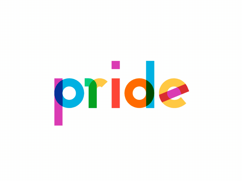
During pride 2018, Google launched a #ThisIsFamily campaign, which ended up winning an award from Fast Company’s World Changing Ideas, 2018. Our team created the logo and my job was to create an animation that could be used in a video. This is the process for coming up with that animation, finding inspiration, and figuring out what worked and what didn't.
Research
Paper stop motion
The goal was to convey a sense of home and family. I felt we could possibly do this using stop motion animation and paper. Our idea was to have a mandala resolve to the logo. Here's an example of a stop motion piece on Dribbble that demonstrated this concept well.
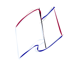
Cloth flag
The other concept for the animation was 'cloth based,' which allowed us to incorperate the cloth of the pride flag in to the logo. This is another piece of inspiration from Dribbble, developed for NYC pride. I liked the way they used trim paths to draw the letters. Using trim paths, we could make strands of a flag unravel to form the logo. This was the concept selected.
What worked
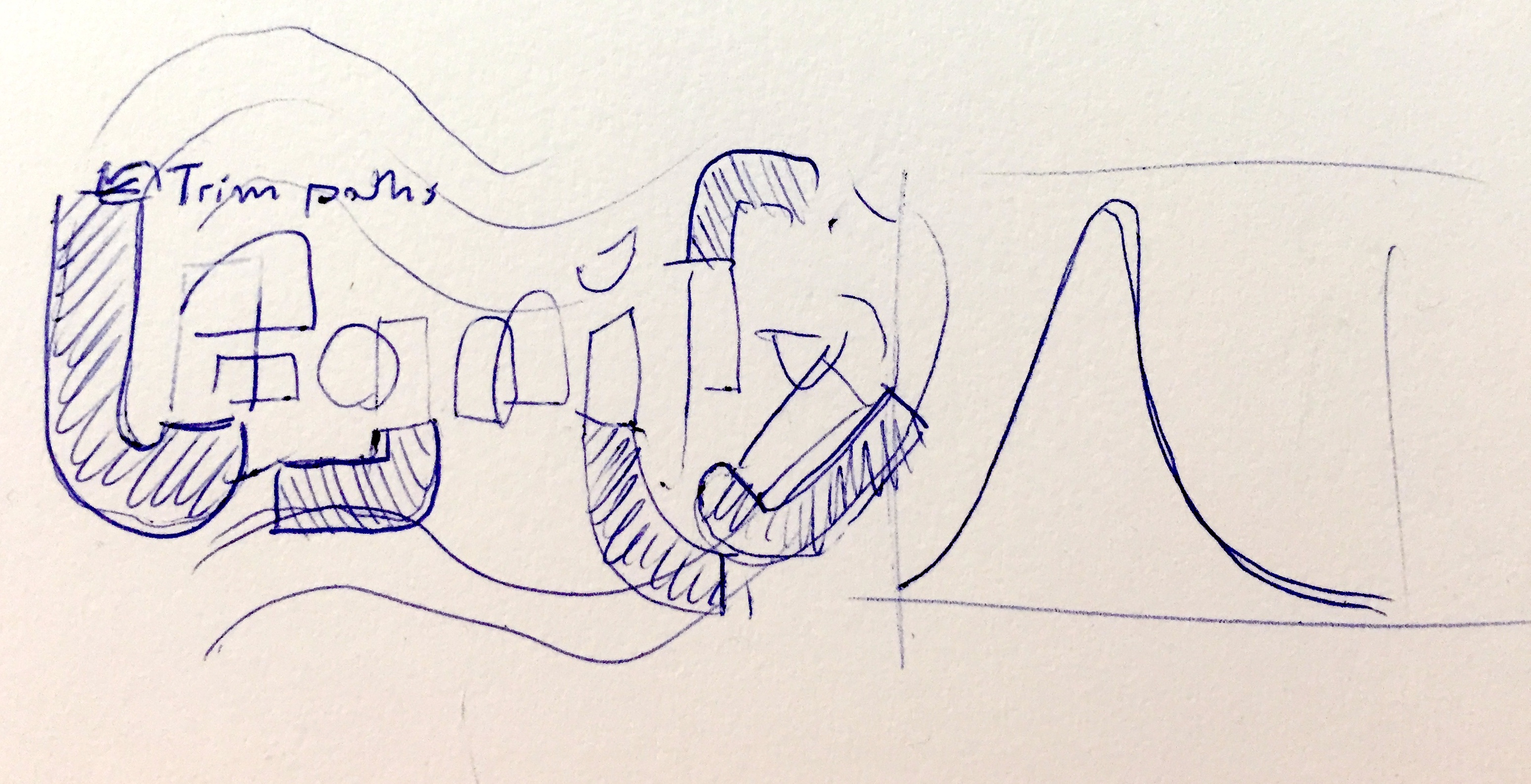
Trim paths for strands
Using the ribbons from the flag to form the logo worked well, and was fairly easy to animate. However we still had a big challenge figuring out how to get the flag to wave.
What didn't work
Cinema 4D
Using C4D, I made a quick cloth simulation and applied a sketch and toon texture to it. I hoped this would fit the flat, 2D style of the logo, but in the the end the 3D flag didn't quite match the 2D look we were going for.
Animate (Flash)
The next approach was to hand draw each frame in Flash. I thought maybe this would give us more control. But it just wasn't working and we were constrained on time.
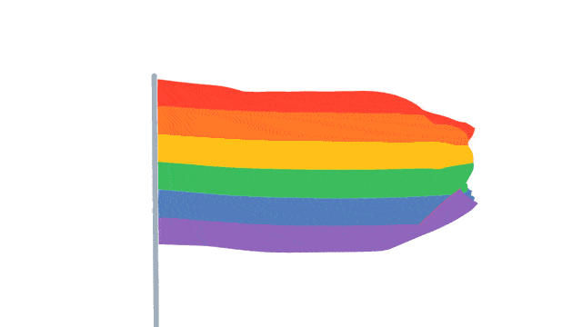
Result
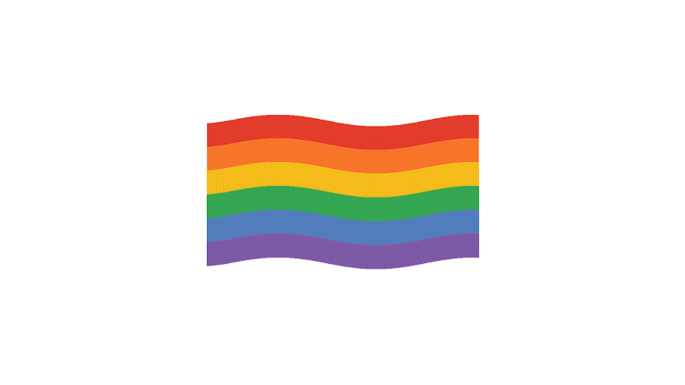
We simply just used the flag wave effect in After Effects. This was perfect because it fit really well with Google's clean and simple techy brand.
< BACK